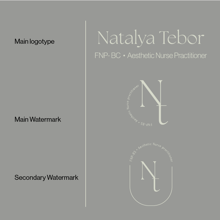
Aesthetic Nurse Practitioner, Natalya Tebor, wanted a refined, professional brand image to enhance her presence on social media and public platforms. Through a collaborative process that included thoughtful discussions and multiple design iterations, we arrived at a cohesive brand identity that aligned with her vision. The final design features a neutral color palette of pastel browns and olives, a classic yet modern serif font for the logo, and chic, minimal watermarks—striking the perfect balance between sophistication and approachability.


Round 1 Iterations
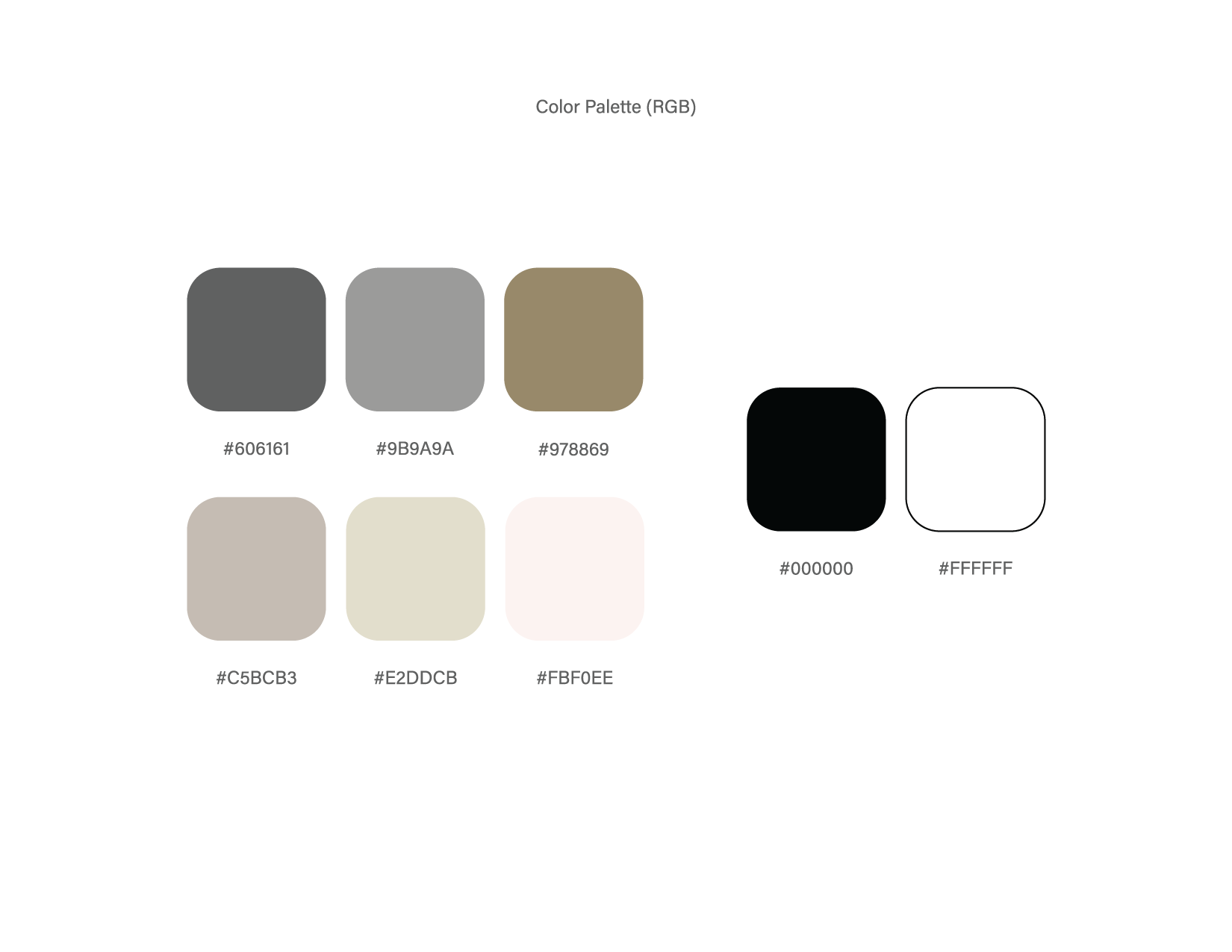
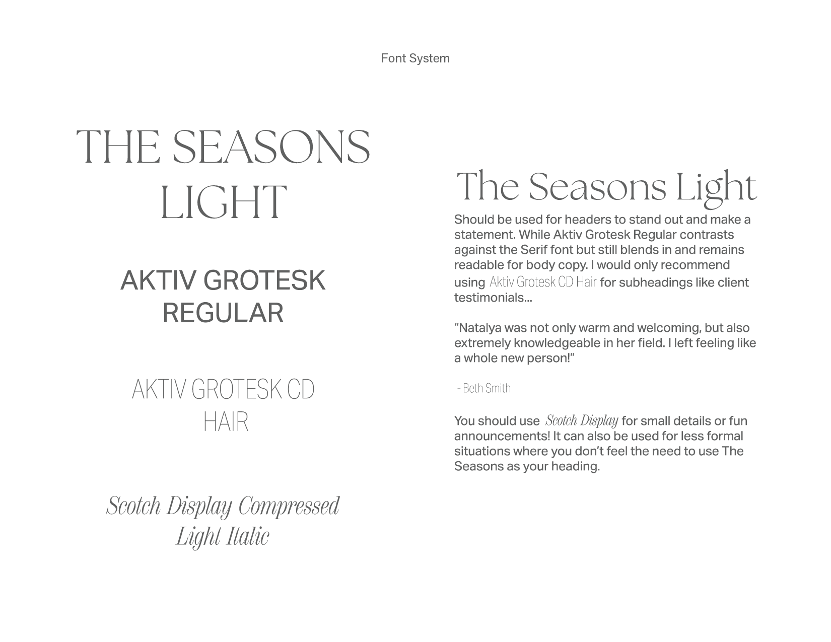
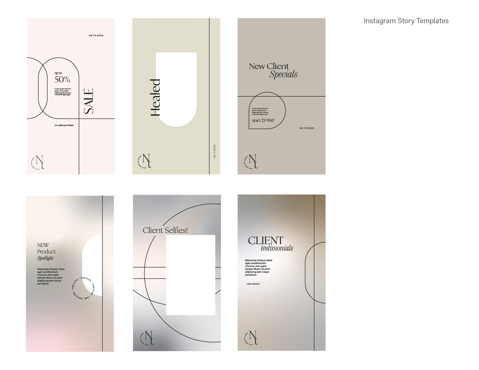
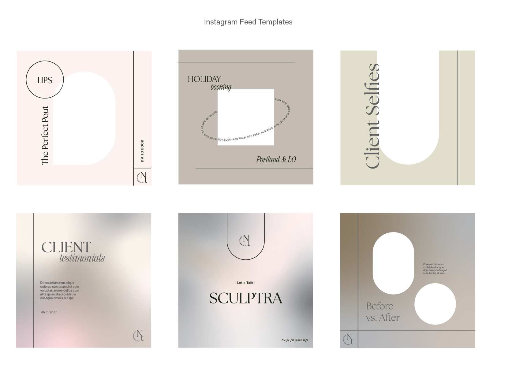
Final - approved brand deck for Natalya.


During Golden Boutique’s conception, I was contracted to design its foundational branding, including the logo, watermark, and initial marketing materials such as customer cards, business cards, signage, postcards, and stickers. As Golden has grown and defined its identity within the Lake Oswego community, this project builds upon those foundations. The updated designs take a more playful and trend-focused approach, reflecting Golden’s unique energy as a Gen Z-inspired, style-forward boutique. While distinct from its sister store Adorn, Golden continues to evolve its connection with customers, embracing a vibrant and dynamic brand identity.
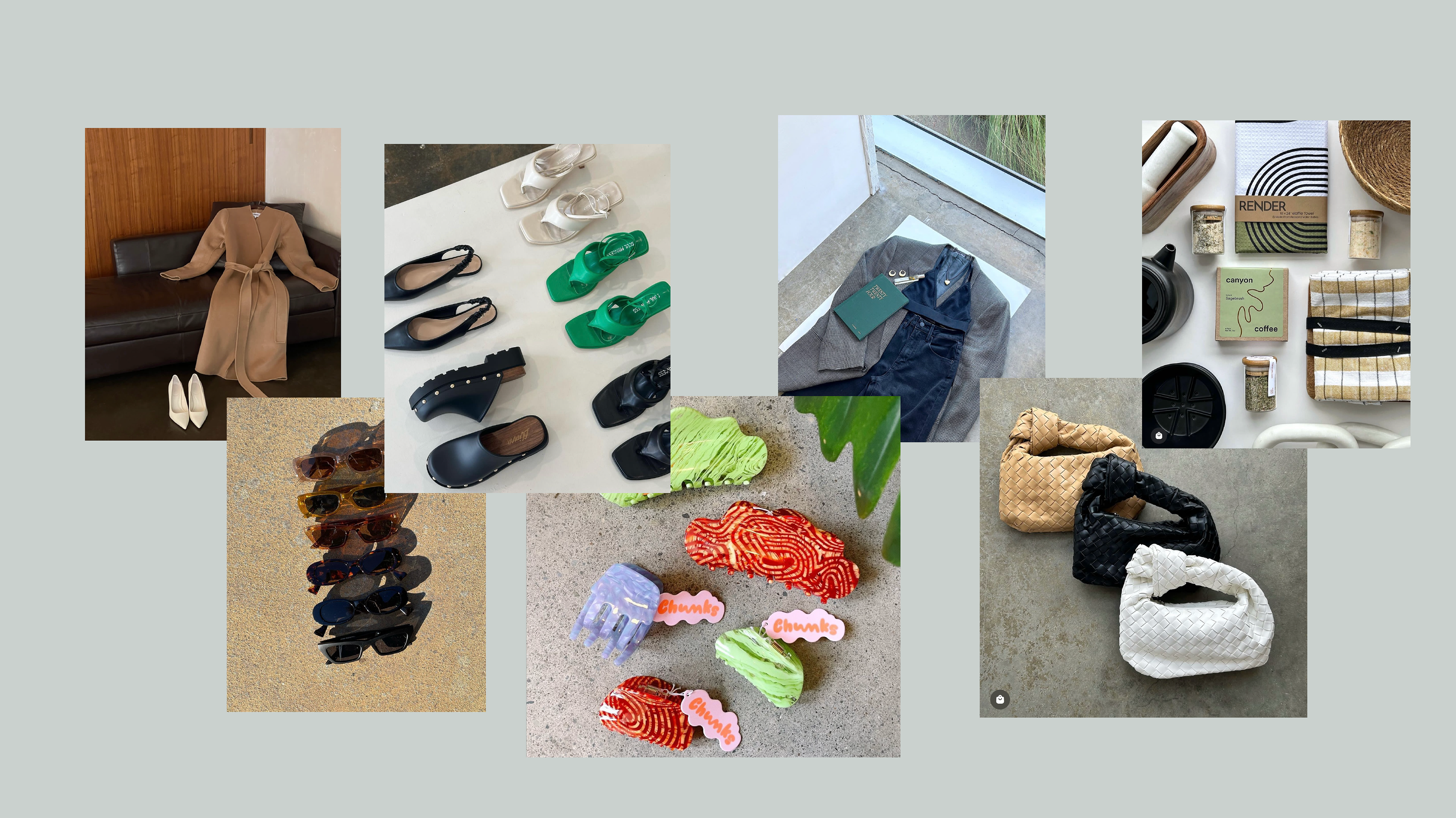
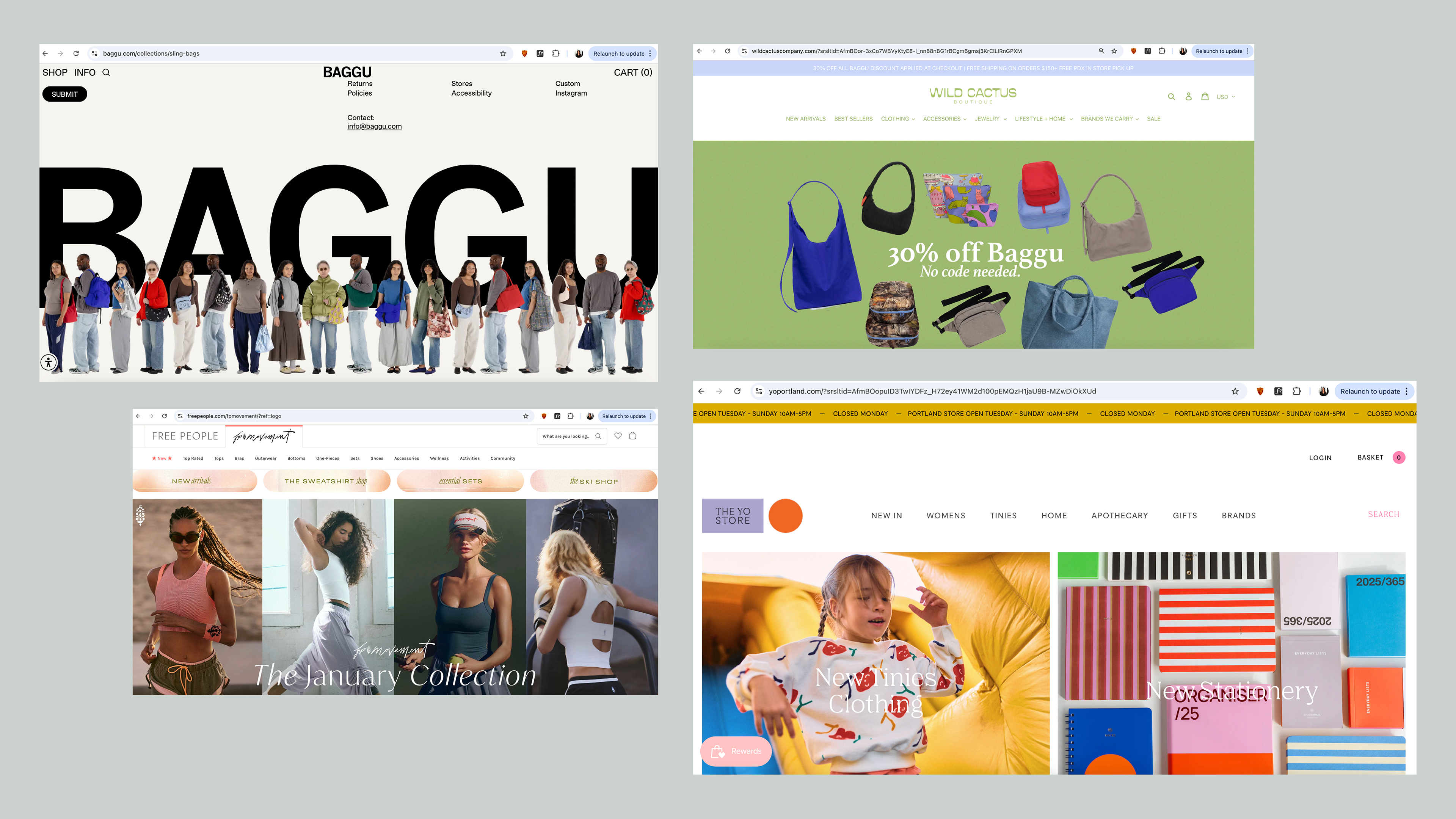
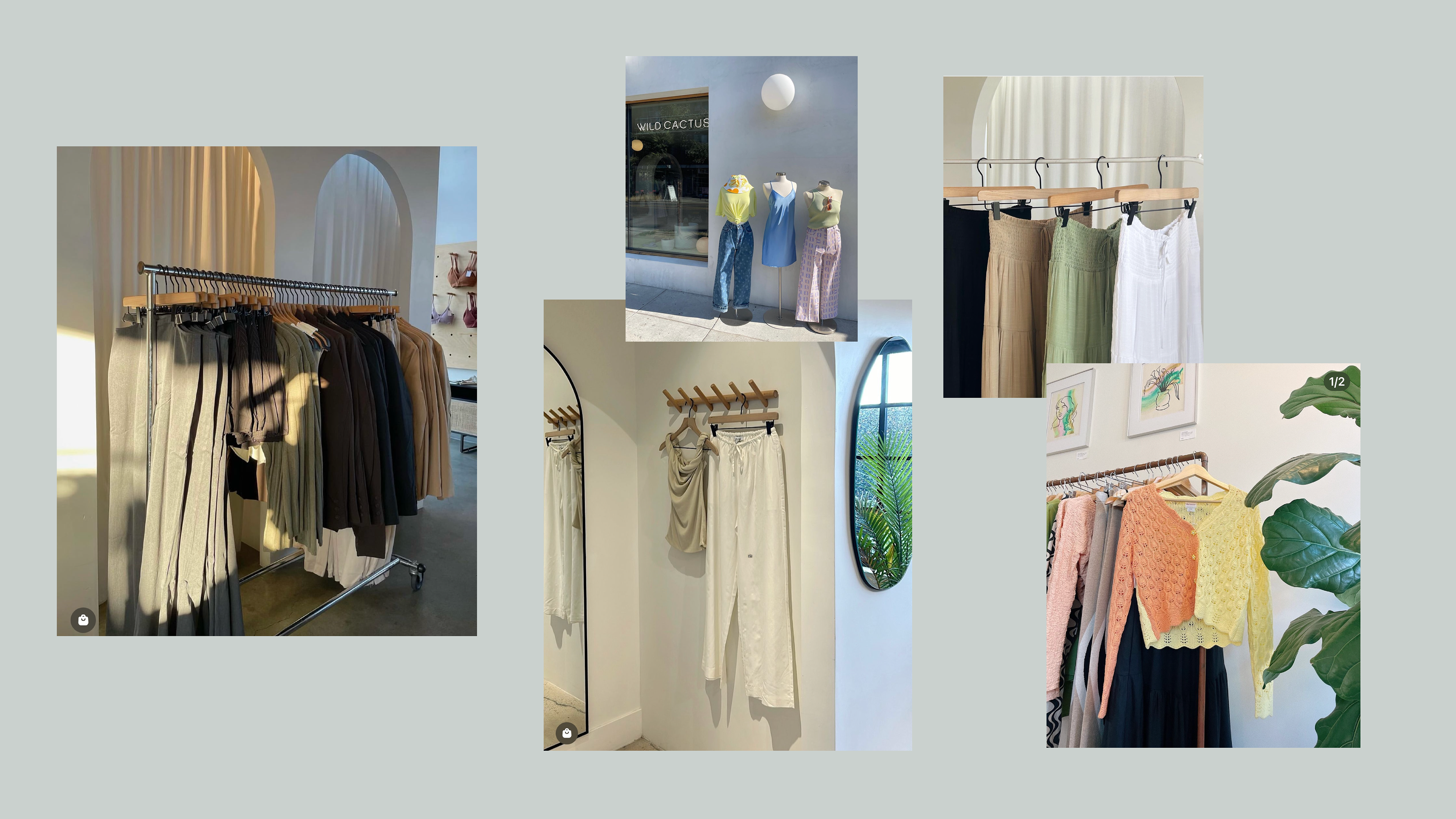
Snippet of a pitch deck for Golden's brand tone - the focus here was on our social media presence and how we wanted to approach breaking into e-commerce. Sourcing inspiration from other creators, businesses, and designers assisted in the developmental process when finding Golden's tone. (The images on these slides were sourced via Pinterest and Instagram and do not belong to Golden.)
